Hospitalhof in Stuttgart
Hospitalhof in Stuttgart, 2014

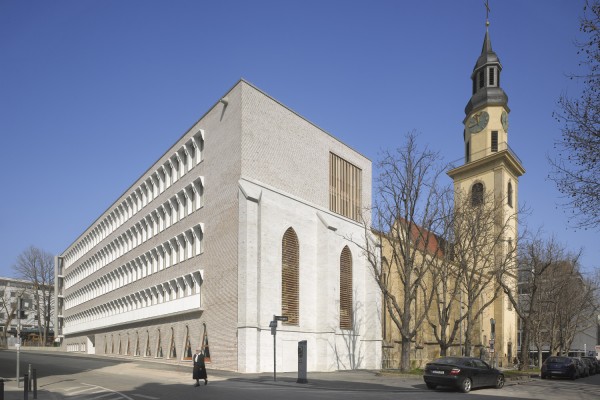
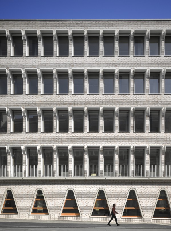
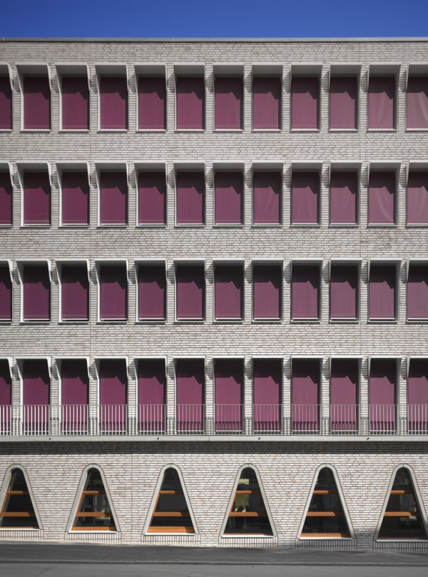
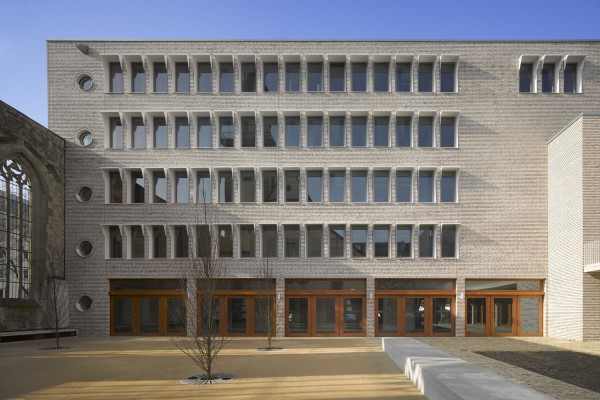

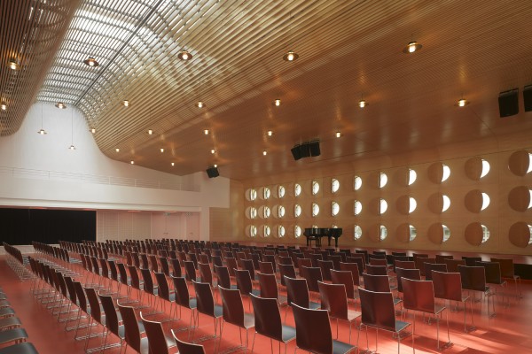
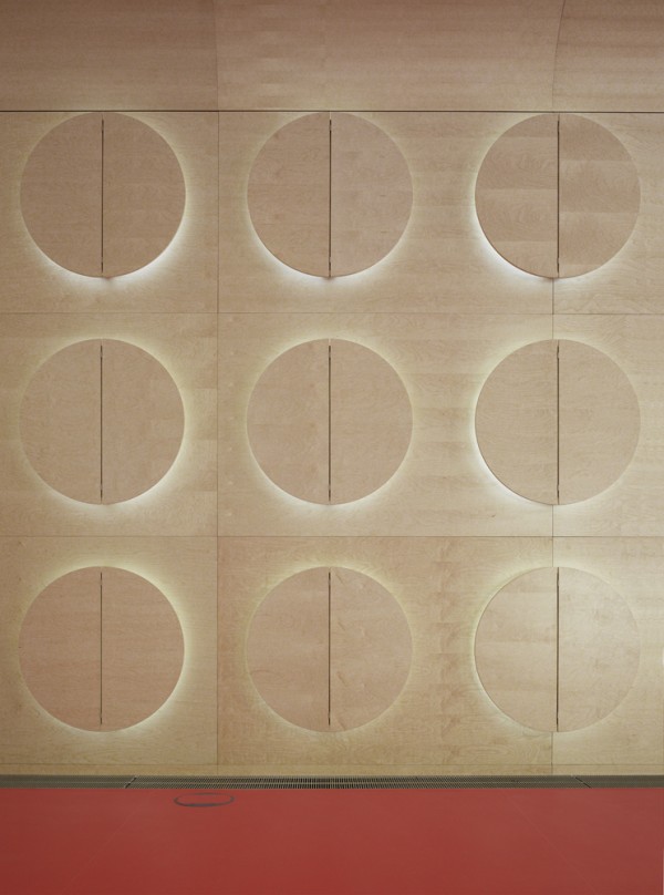
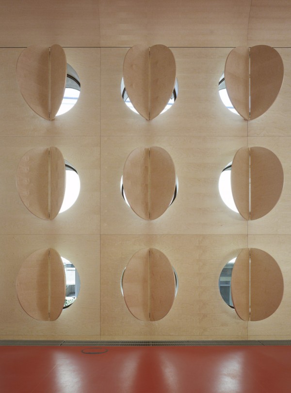
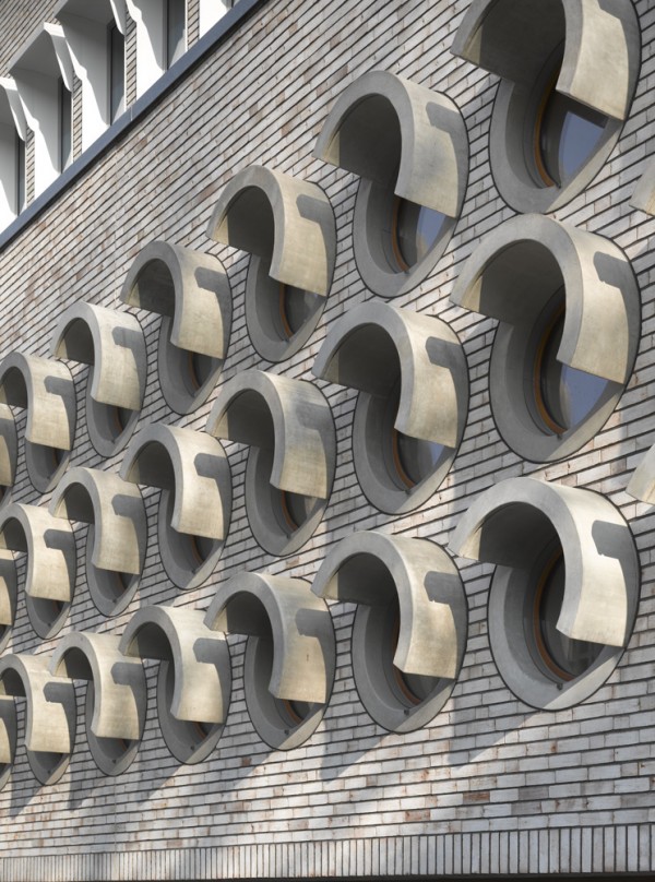
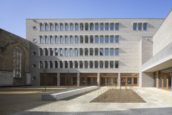


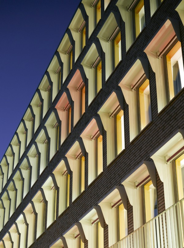
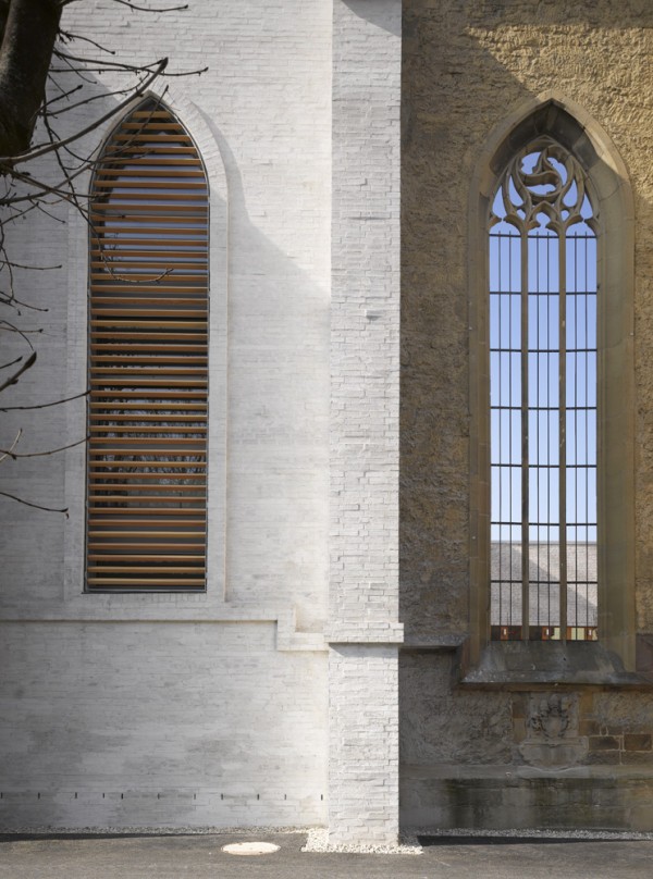

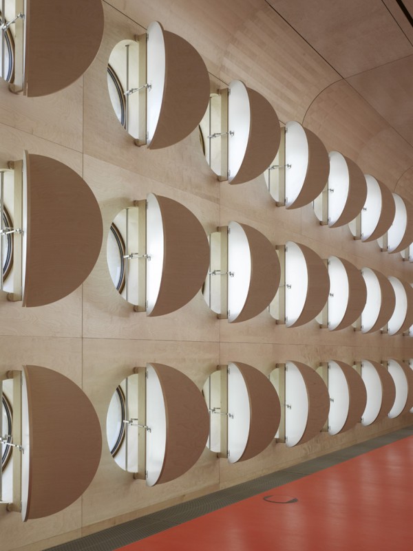


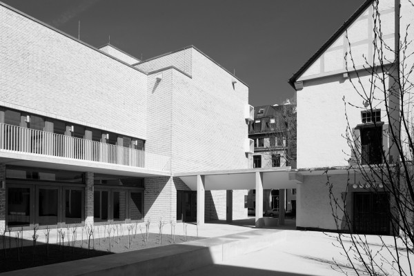
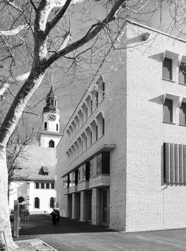
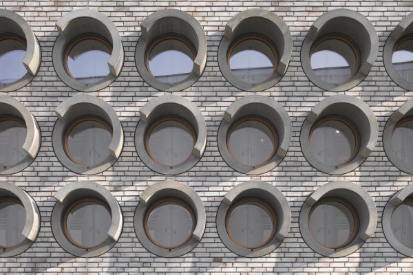
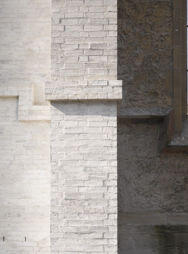


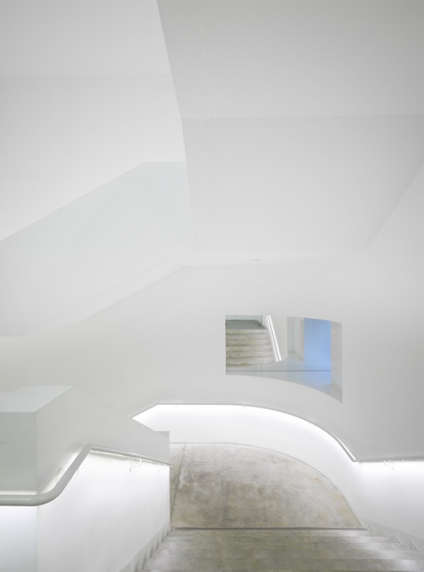

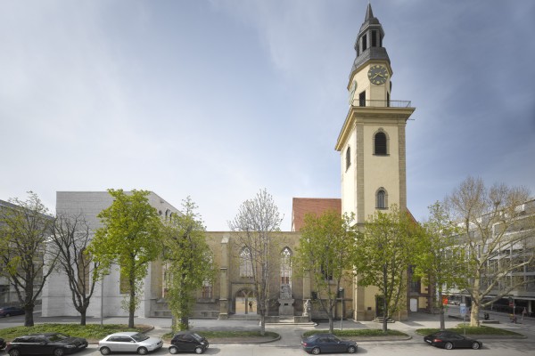
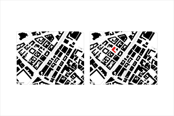
A building is always just part of a whole: it is part of the landscape and part of the city in which it stands. And so we understand the task that has fallen to us as one that does not relate solely to the building that shall be built, but as a contribution to the city and the immediate vicinity in which it will stand. The image of the city is always a status report on the cultural, social and economic condition of its residents. Building is therefore a communal task.
An old proverb says that the church, town hall and school are among the special buildings that characterize a city. They have, in other words, been deemed free from the characteristic style and order of the “normal” buildings of the conventional town. Our perceptions of the concept and qualities of the European city affirm this image. Indeed, we expect the special status of the cultural institutions – that is, the cultural buildings – as well as those of the political and legislative powers and, most of all, the sacred buildings, shall find a visible expression within the network of residential and commercial buildings.
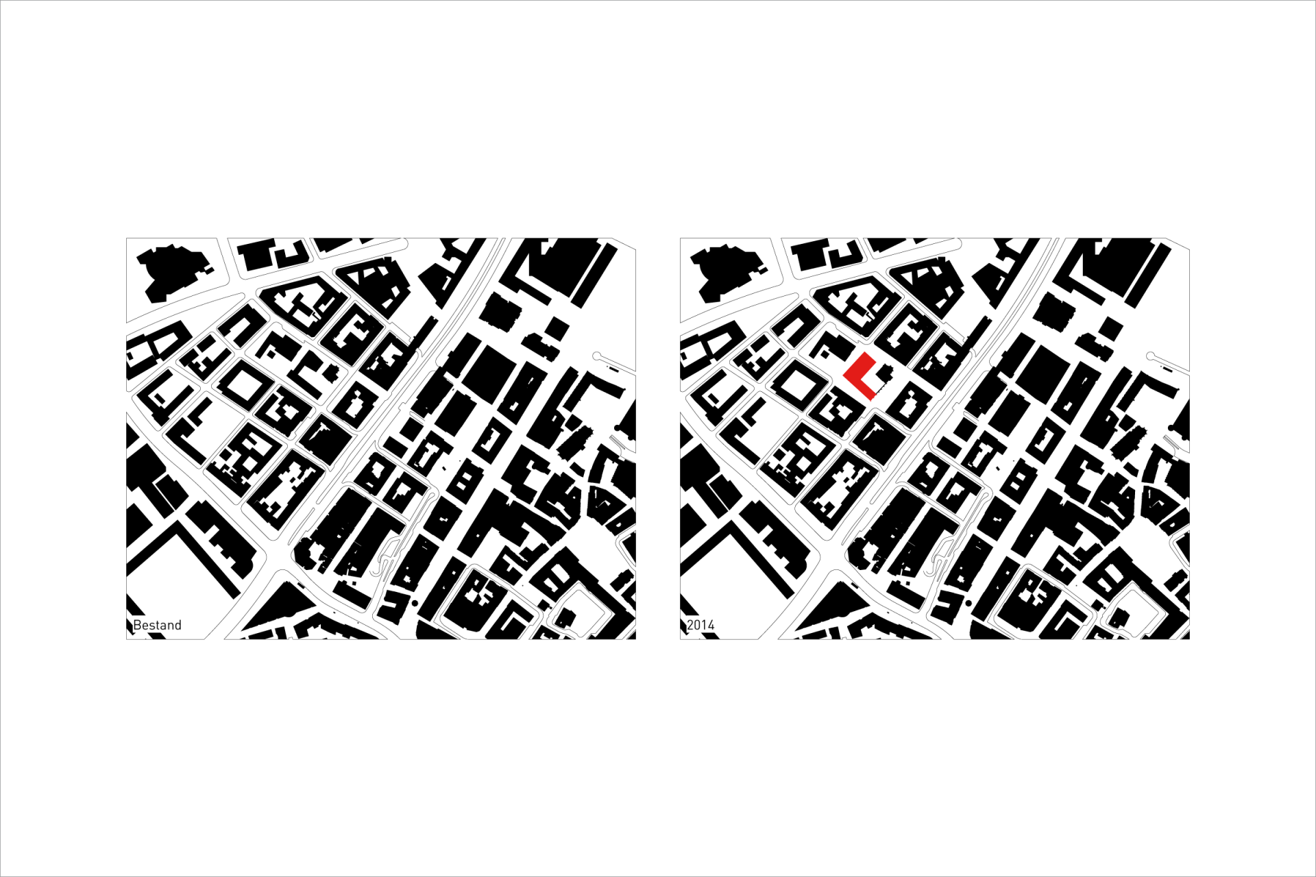
A glance at old plans of the urban layouts of European cities confirms this rule. Even those who are not acquainted with reading these depictions can, at a glance, comprehend where the important public institutions are located. One of the oft cited examples for this circumstance is the so-called “Nolli plan.” What is meant is the city map of Rome, which . . . Nolli, in his role as its surveyor, brought to paper from his examination of the city. What makes this plan so exemplary is its form of representation: whereas the anonymous domestic houses are only portrayed en masse with a general outline filled by a collective hatched area, Nolli delineates the actual floor plans of the special buildings in the city. So you can very clearly see the relationships these buildings have to the public space, with which they enter into a dialogue. If one were to remove these buildings from the plan, the anonymous hatched network of a disordered conglomeration of buildings would remain. Conversely, forfeiting the anonymous structure of the residential houses in favour of distinct architectures would yield a chaotic mess.
The situation would become even more drastic if we were to excise the churches and monasteries of Central European cities from their ground plans. That is because both categories of buildings, the anonymous and the special, are found there in a meaningful relationship. Without either component, the image of the city and its natural order would be destroyed.
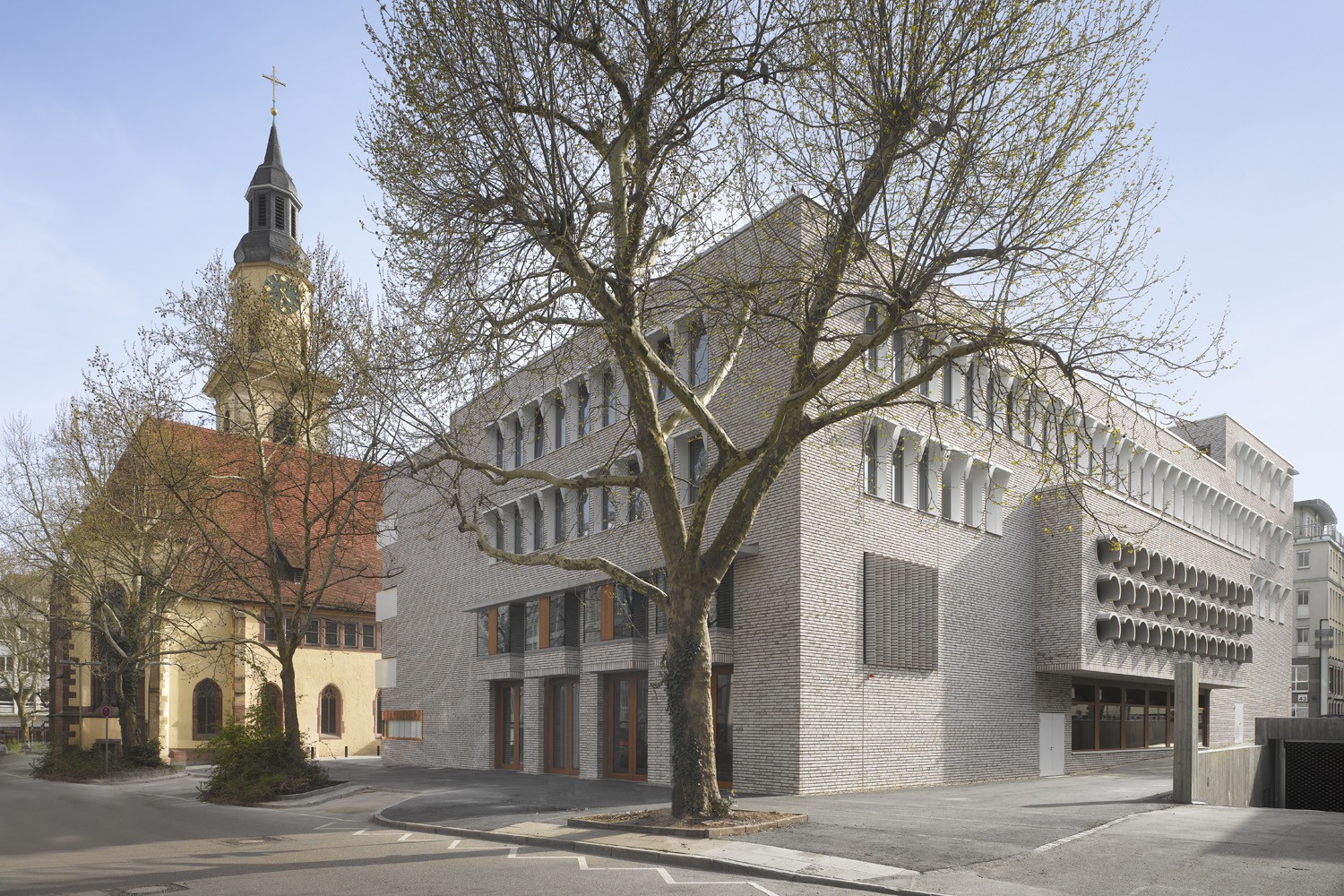
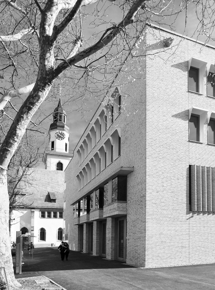
We have expounded on this view of the city and its buildings in such detail because that was the starting point for the consideration that was to predominantly determine the design. With this building project, we not only find ourselves in a district whose form was assured into the distant future by a precise plan, but also in the new (suburban) city that its creators set out along the lines of Turin’s urban plan. Even today it is not difficult to discern the rectangular grid that differentiated the hospital quarter from the skewed pattern of the historic old town. The “hospital” itself – that is, the former Dominican monastery along with its church – stands out from the layout not only due to its size. It is, as in many similar situations, the eastern orientation of the church that is a hallmark of the special public space here.
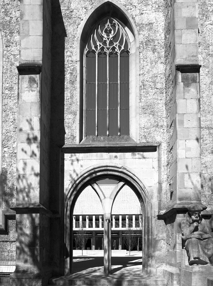
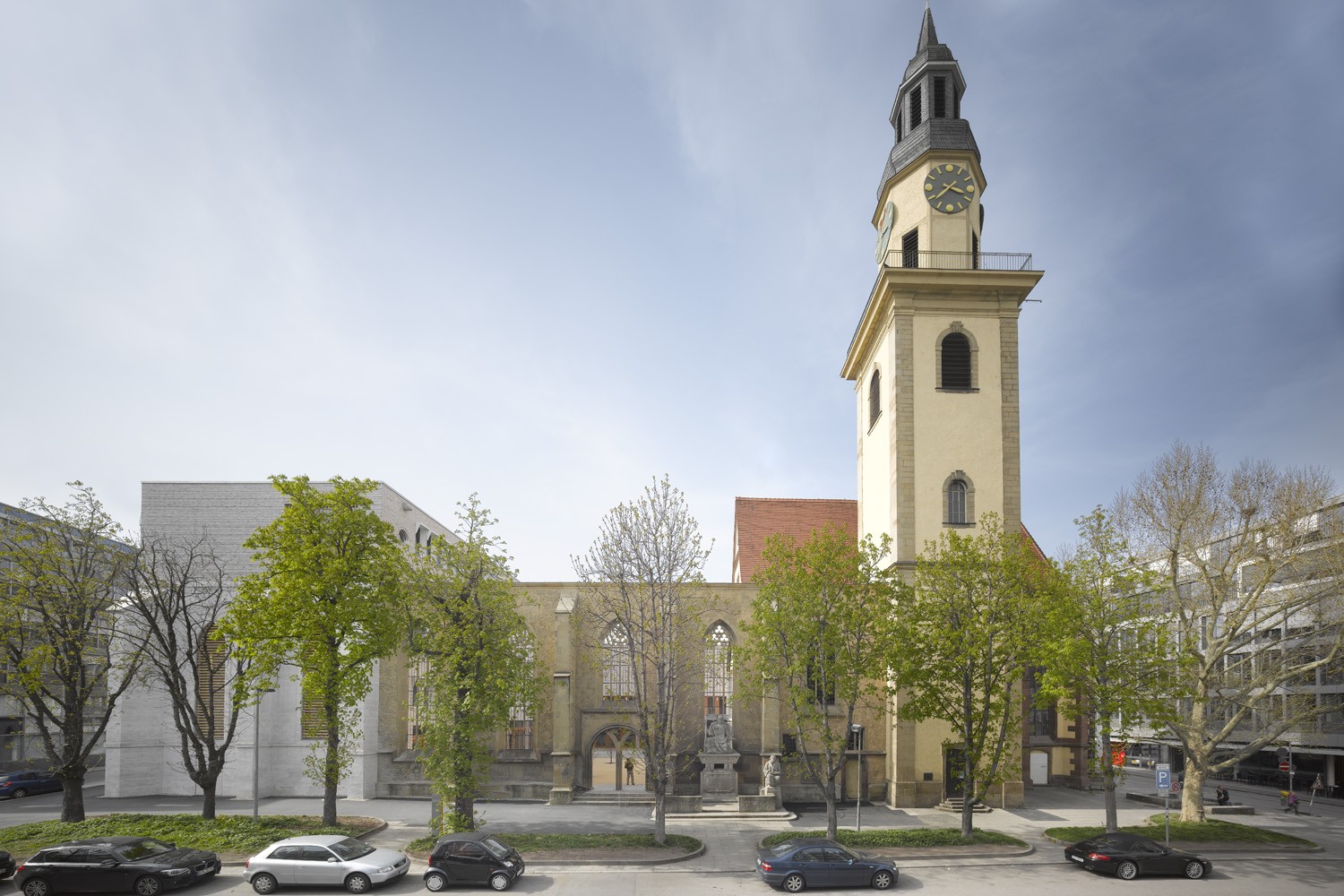
The difference to the plans that were created in the post-war period is conspicuous. The clarity of the urbanistic idea is blurred. There are two reasons for this: For one thing, the post–World War II generation had difficulties in dealing with history. For another, there was the attendant idea of modernism, which had already developed a different notion of urban space. Although the architecture of the 1950s and 1960s is neither better nor worse than that of today, it was primarily the abandonment of strict building alignments that diluted the original planning ideas. Then the church wall along Hospitalplatz was also shortened for the benefit of an administration building, thus diminishing the ecclesiastical building’s original presence toward the public space. In any case, only the altered chancel remained from the actual interior of the church. The relationship between the inner and outer space, as described by the Nolli plan, was evidently overlooked (or intentionally ignored). Is not the space of the nave inscribed in our memory as a public space that is inextricably engaged in a dialogue with the surrounding squares and streets?
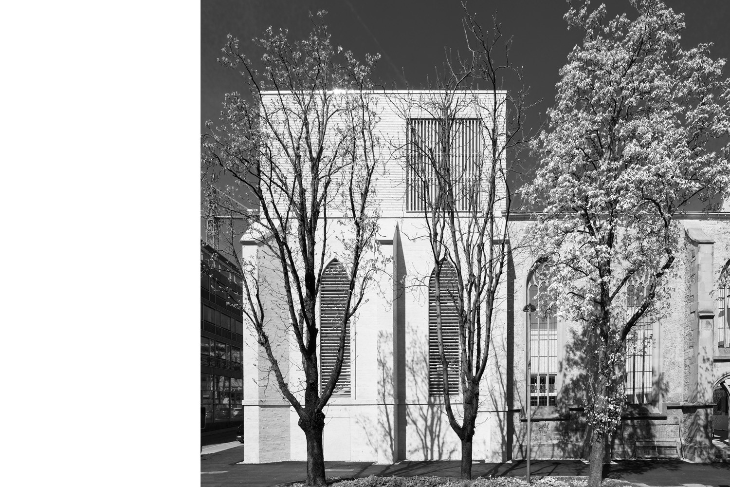
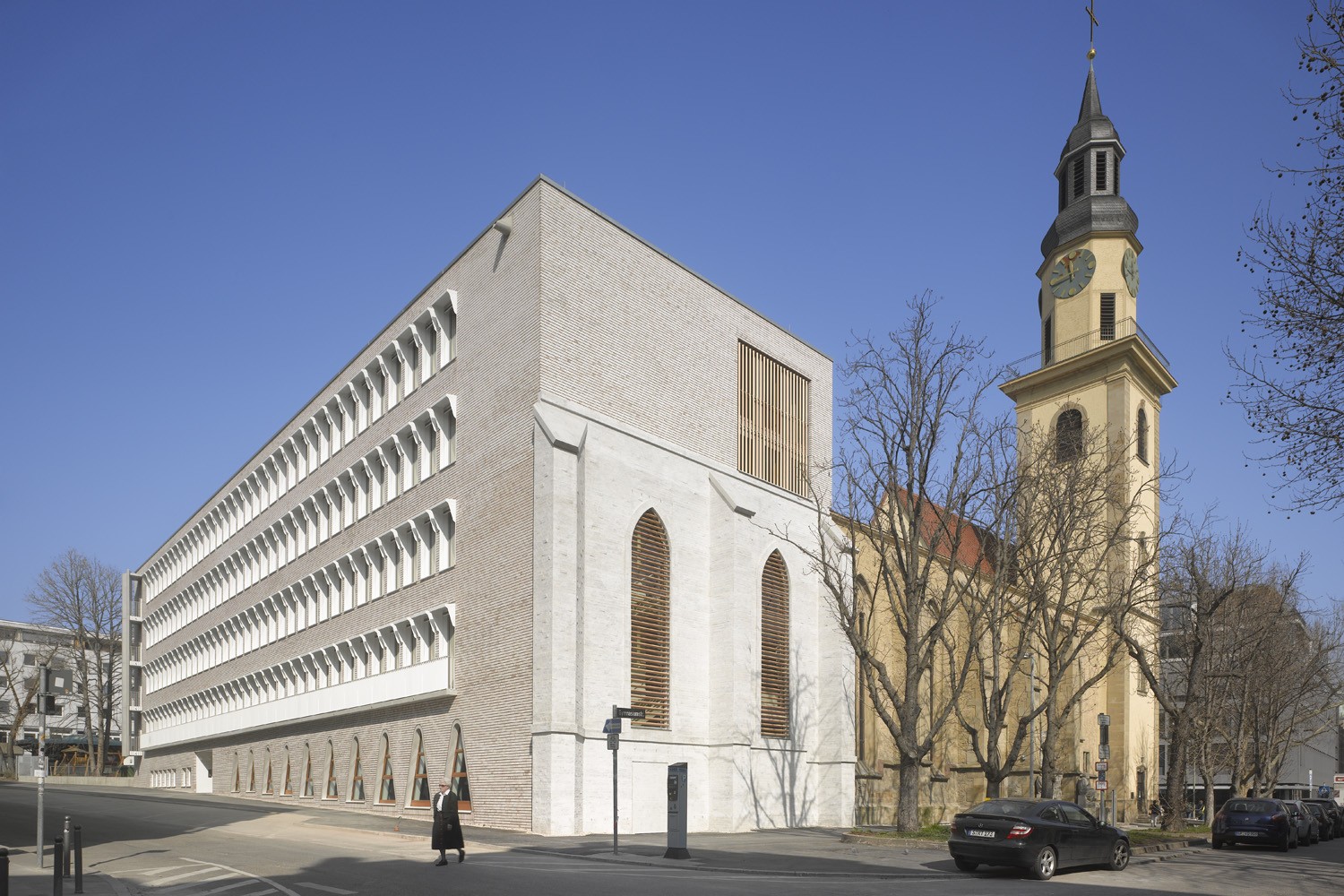
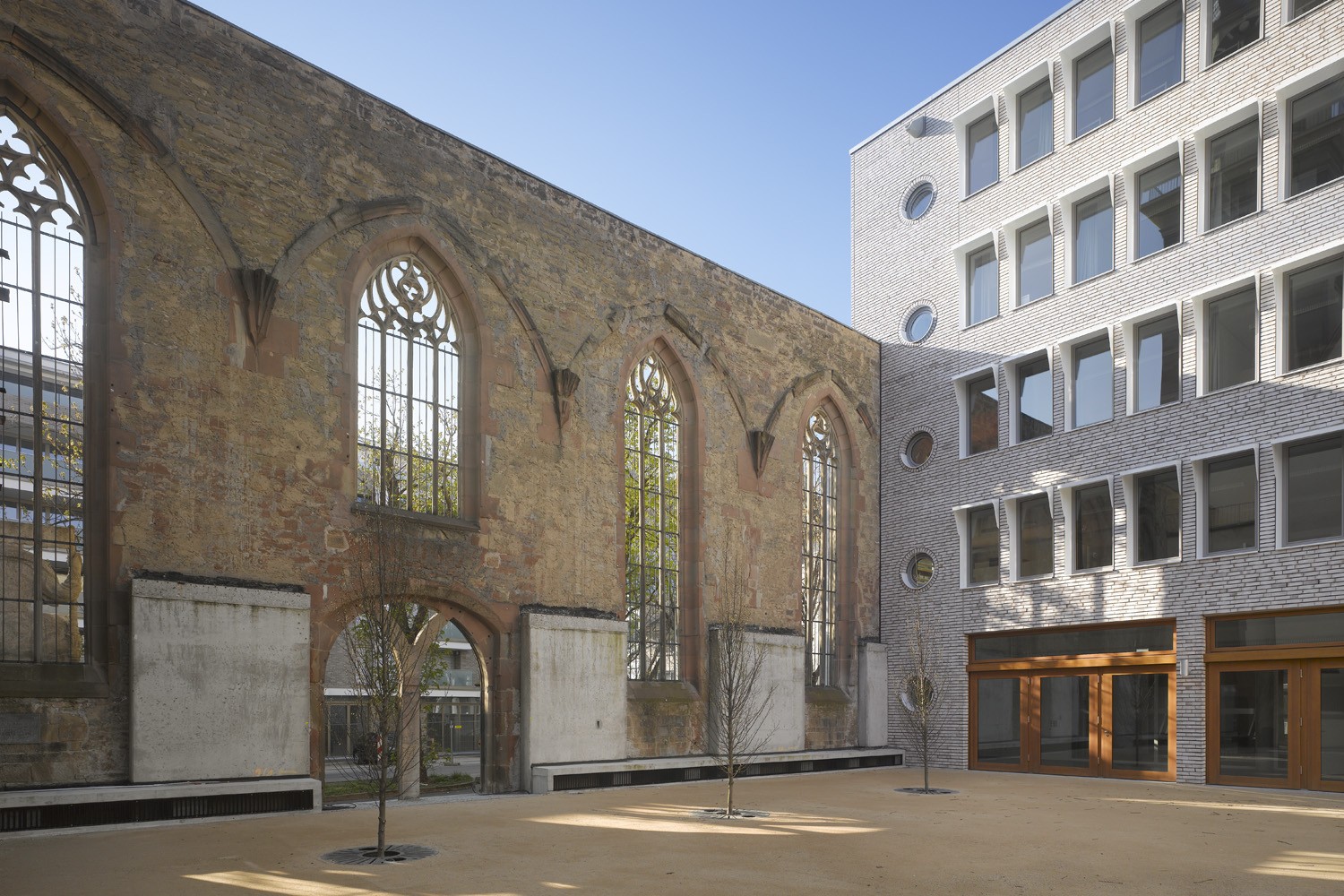
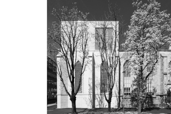
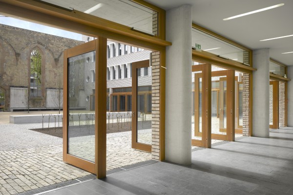
Of course, the theme would have been missed had we dared to take up the proposal to rebuild the volumetric form of the church. But the decisive factor was reducing the building dimensions to fit the alignment that the Dominican monastery had formerly taken, in other words: rotating the ensemble within the city layout. Later we came up with the idea of extending the torso of the church wall to its original length so as to at least recall the original association with the square in front.
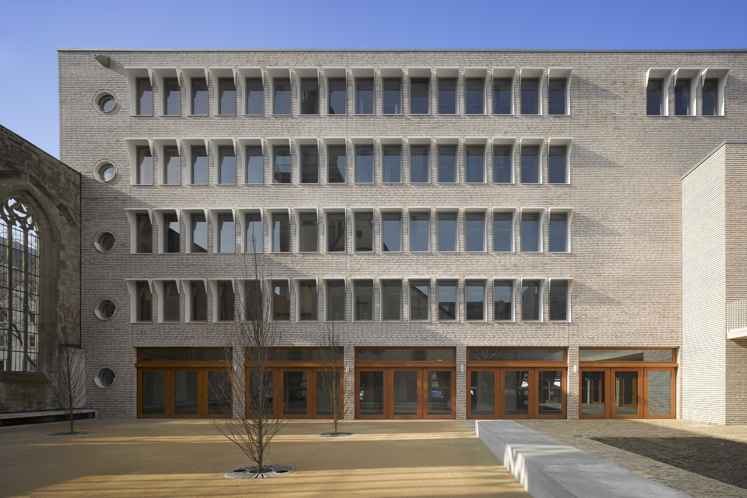
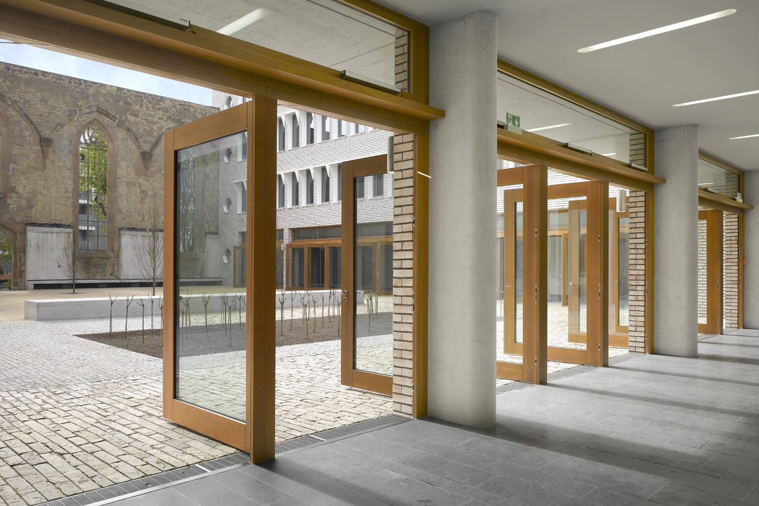
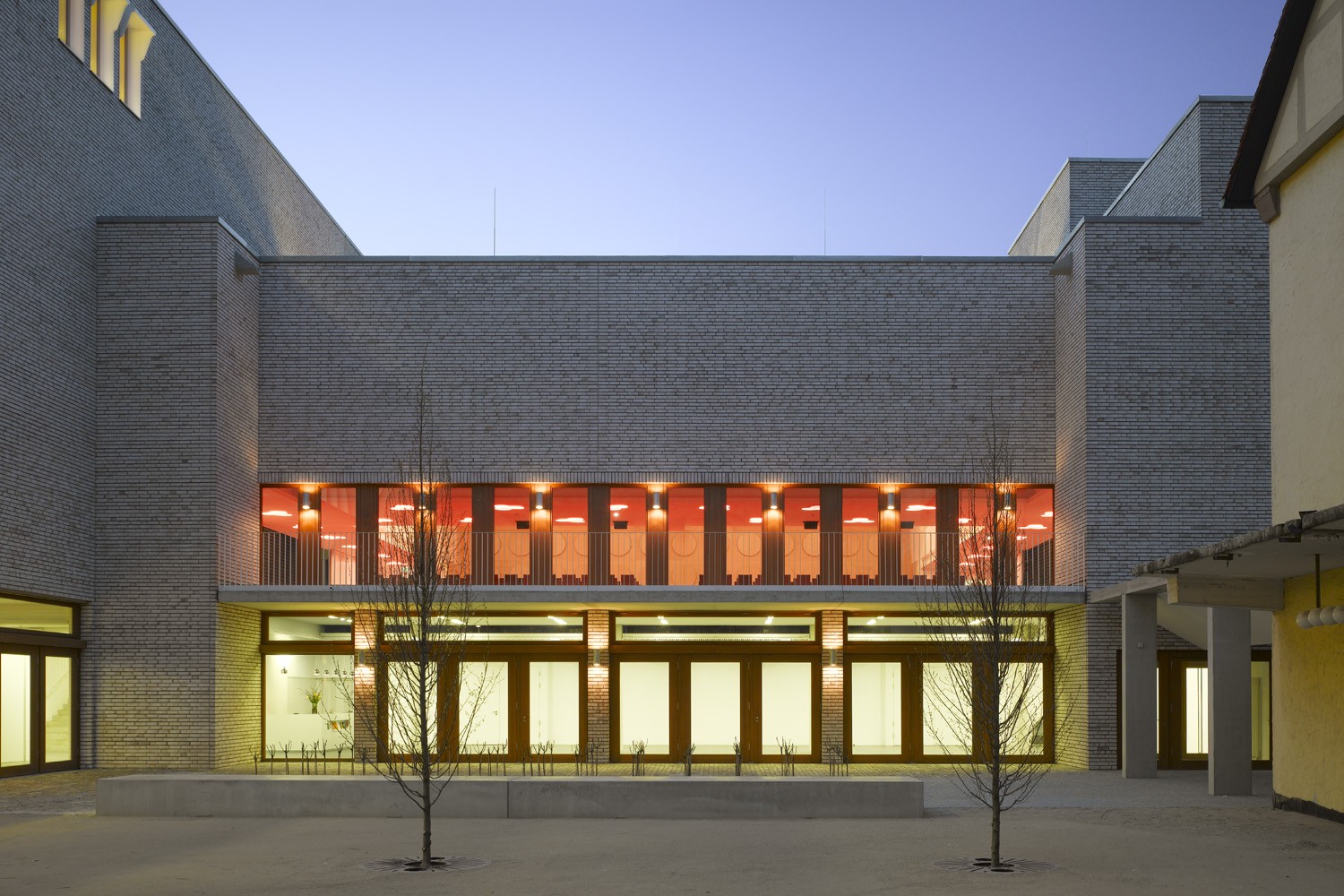
That essentially explains the urban spatial intentions, since the desired functional units – such as the halls and rooms for the educational centre as well as the areas for the administration – are organized along the newly defined alignments of the historical plan. Taking the required room depths into account, what consequently remains is a sufficiently large inner courtyard that is oriented on the former cloister. This space is divided into two areas: the portion corresponding to the former church interior and the open space that joins with the foyer of the Hospitalhof at the ground floor level. At the places where Gothic columns once supported the vaults of the nave, we planted slender, high-growing trees. Here, in balmy summer weather, our concept envisions that celebrations and religious services can take place outdoors.
Wolf Irion, architect of the post-war building, had placed the main entrance to the educational centre along Büchsenstrasse. That is a thought that we followed in principle. But we have set it back further into the site, at the intersection with the church. At this point we would like to expressly acknowledge the work of Irion, because his design was a very nice contribution and a good example of post-war architecture in Stuttgart. The demolition is therefore not, for example, due to any dissatisfaction with the form of the ensemble: the reason lay in the dilapidated structure and the fact that the building was no longer able to satisfy diverse requirements, such as those for fire protection. In any case, rehabilitation would have only been possible, if at all, by expending a disproportionate effort. The essential portions of the underground garage were able to be retained, however, even though this has nothing to do with the underlying issue of the architecture.
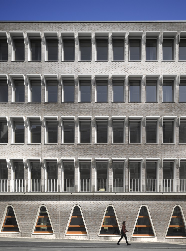
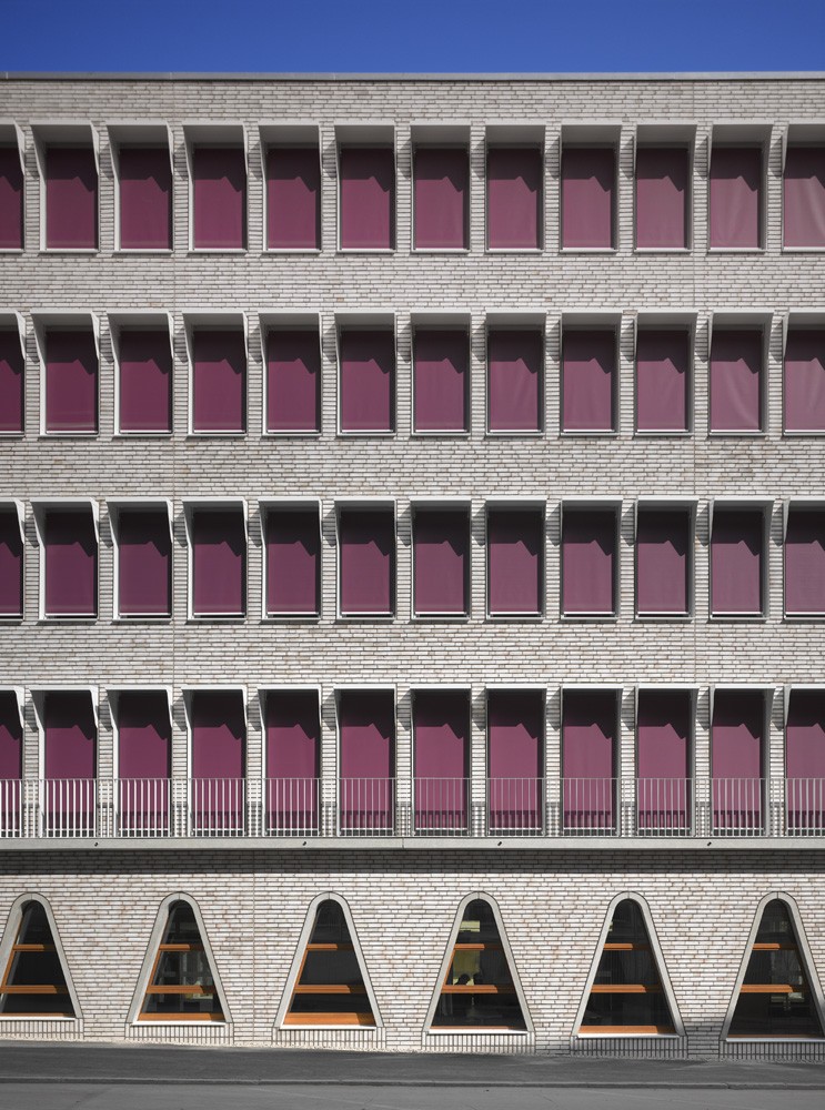
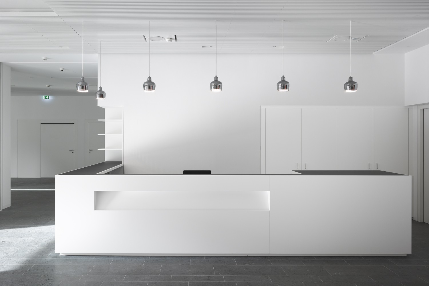
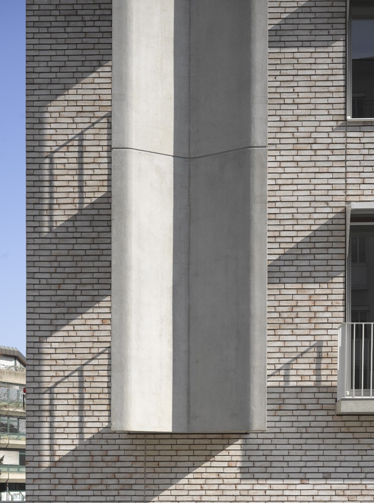
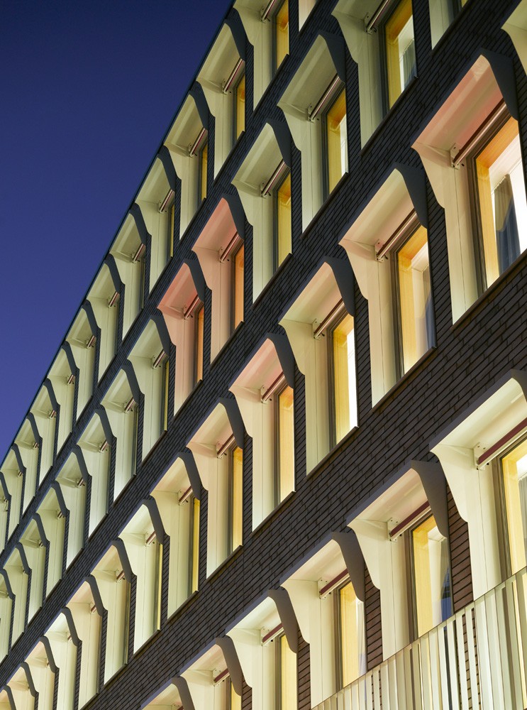
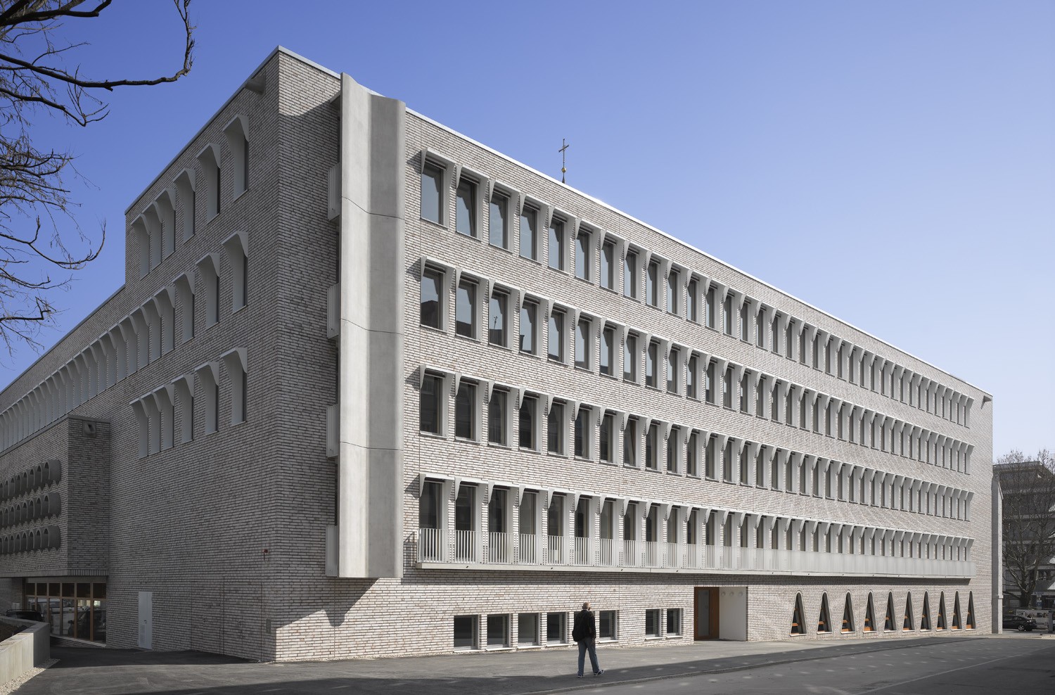
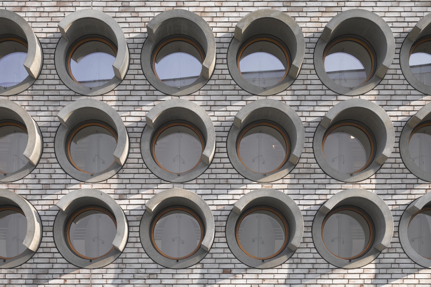
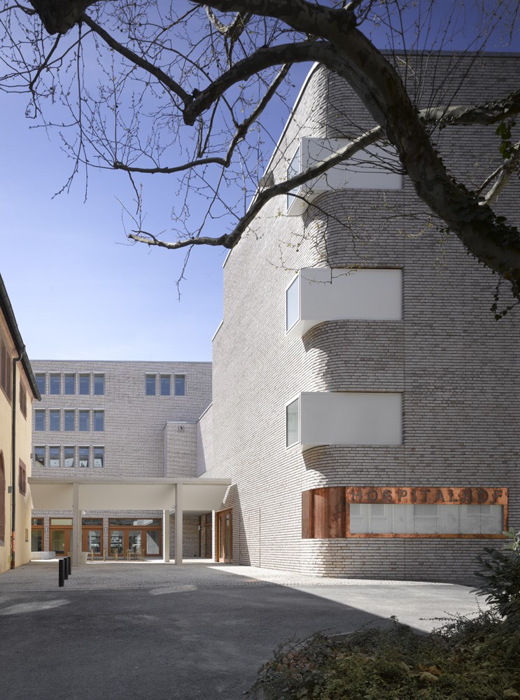
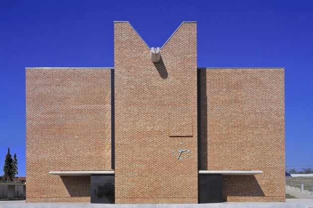
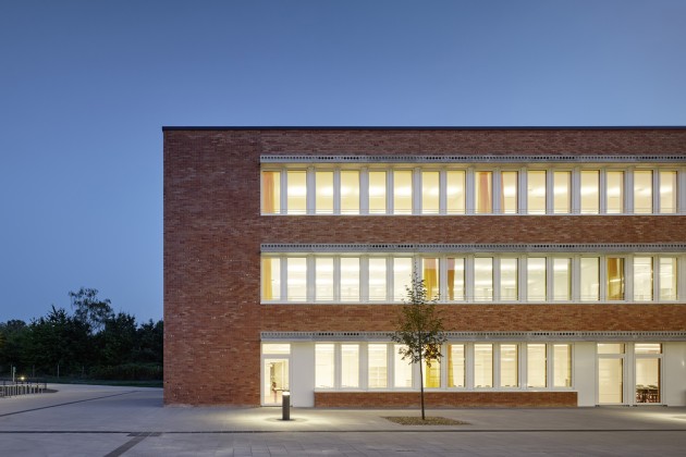
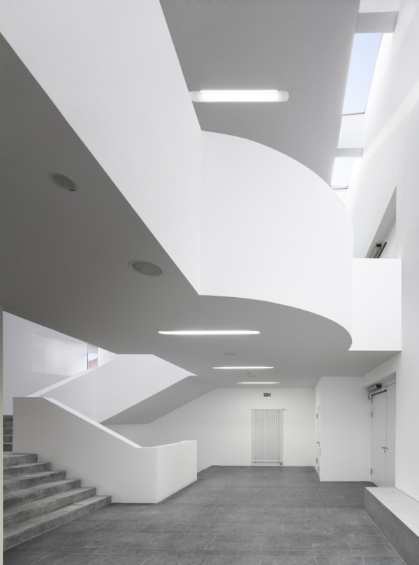
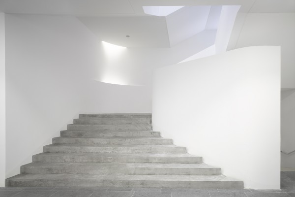
The outward appearance of the building is now characterized by light-coloured brick masonry. We believe this is suitable to the character of the inner-city ensemble that represents the quarter’s historical nucleus. Masonry facades are familiar to us at first glance. We are not interested in whether the visitors first ask themselves whether the building looks new or old. More important is the self-evidence with which it is perceived at first glance as part of the city. Familiar and yet new: we see the facades in this balance, which is a property also meant to inform the interior spaces. Hence the ceilings, walls and floors are made of materials that we are not only accustomed to but which, through the way they are combined, also evoke a hand-crafted character. It seemed obvious to us that with this project, the visitors should not be presented with any riddles about how the building is built. One can quarrel at length about modern production methods: but we have a different kind of attachment to all that which is made by hand than we have to industrially manufactured products. You have the feeling that “someone worked for you with their own hands.”
Of course, in choosing the materials, the costs are just as important as the aesthetic and tactile effect. For the outer shell, we followed the precept that facades made of masonry or concrete with appropriate insulation have advantages in many respects: closed facades are not only less expensive to produce, they also have long-term benefits that concern the durability and the maintenance but also the lower cost of repairs. All that taken together, however, is primarily a matter of one’s own position – in other words, of architectural principles that fundamentally lead to different results. There is no fundamentally “better” or “worse,” but rather a difference in how we see the world and how we want to see it altered.
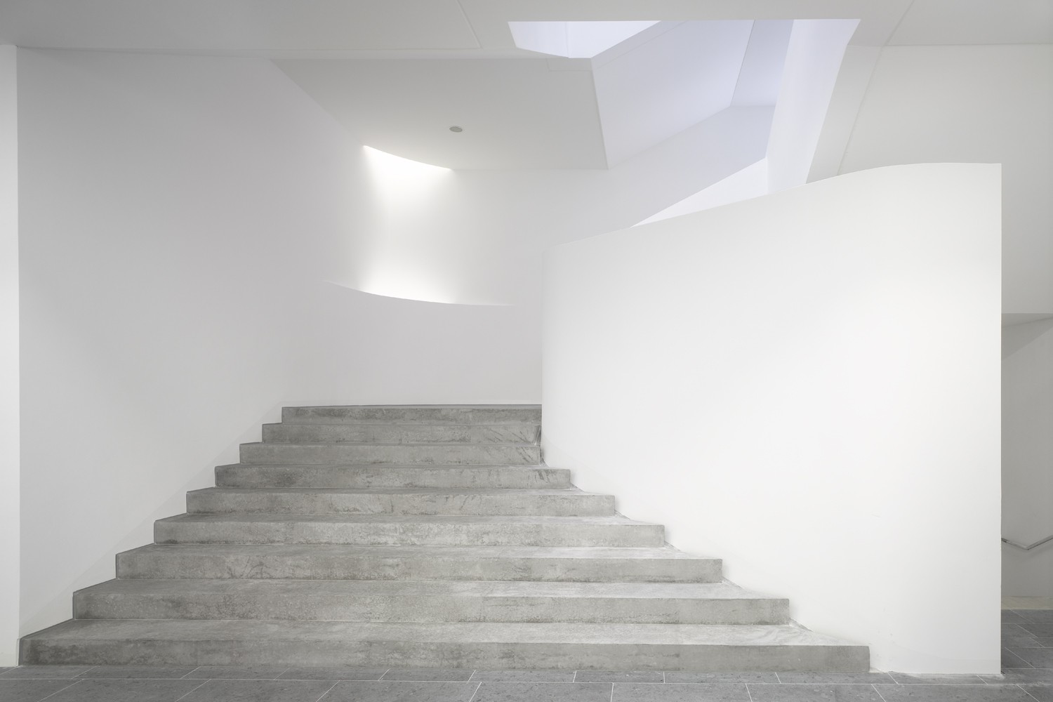
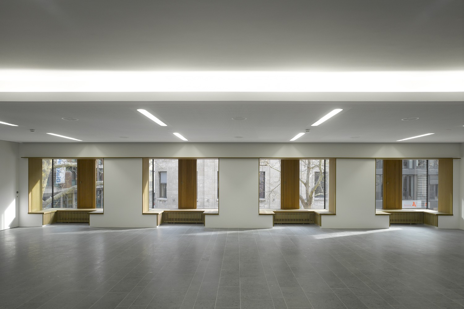
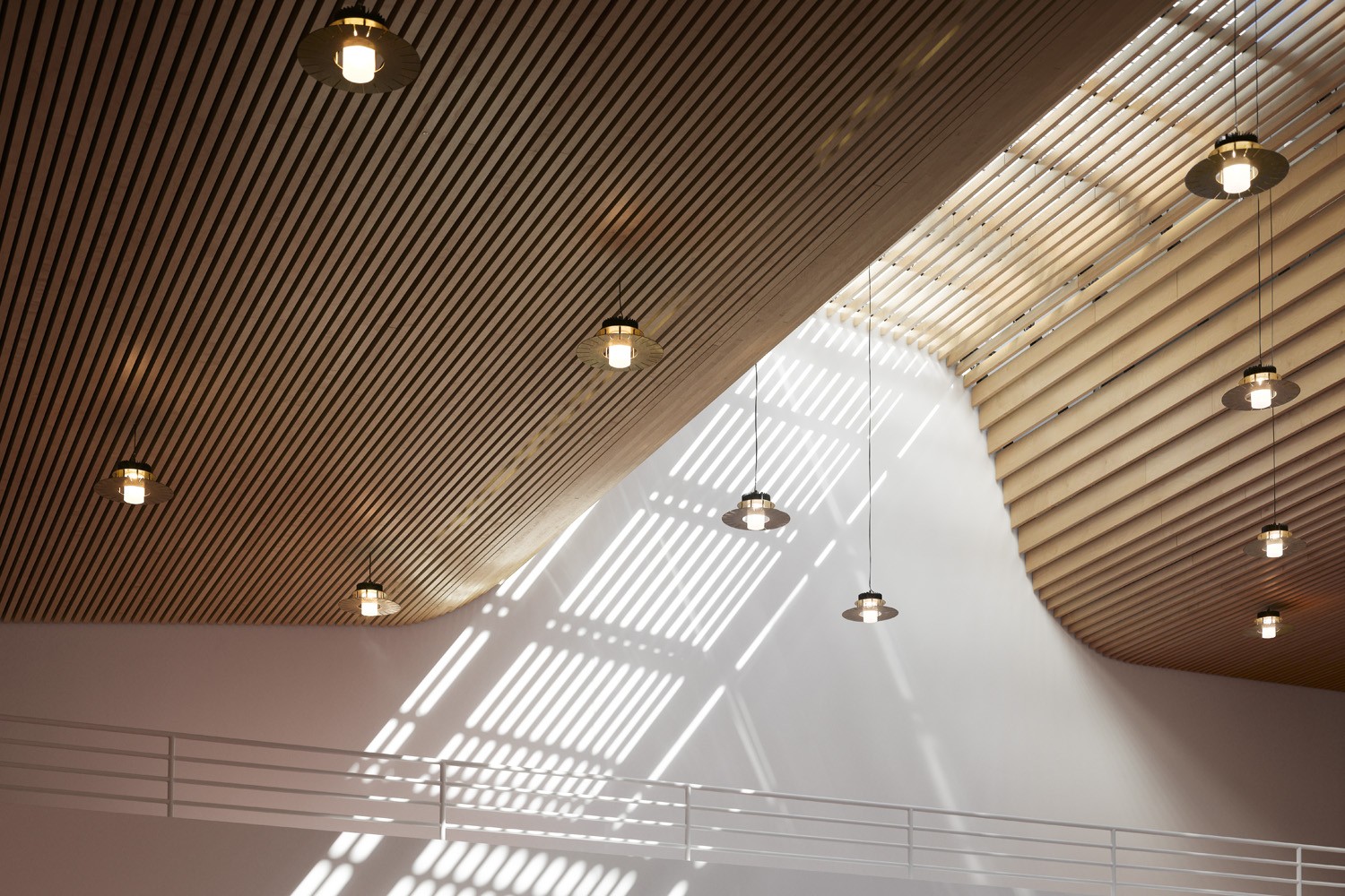
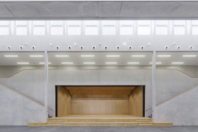
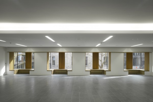
Initially, separate construction phases were planned for the ecclesiastical administration, on the one hand, and on the other, the spaces of the “actual” Hospitalhof educational centre. This idea only had alleged economic advantages: the opposite was in fact the case. In making the revisions for carrying out the construction all in one go, not only were there advantages in cost, but the floor plans were substantially improved, which was particularly beneficial for the layout of the large hall on the upper floor, which is now distinguished by a large skylight that supplies the room with abundant daylight. The nearly square floor plan also meets the desire for accommodating multiple uses. The hall is, in a manner of speaking, the core of the ensemble, around which the other spaces are grouped in plan and section.
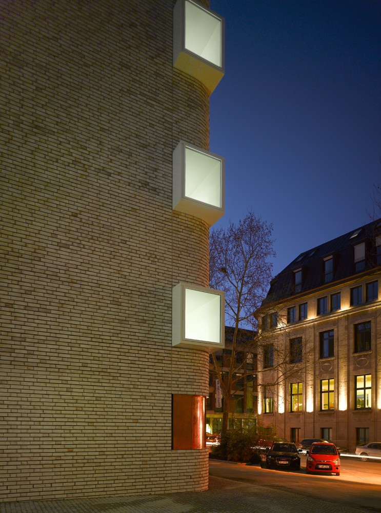
The majority of the conference rooms, group spaces and meeting rooms are on the ground floor along the L-shaped foyer. Here is also space for the art exhibitions that have thus far been an important component of the Hospitalhof program. The hall on the upper floor has its own foyer, which is expressed on the outside by three oriel windows that offer an inviting place to sit.
As before, the administration has its own entrance from Gymnasiumstrasse. The spaces are laid out with a typical office grid of 1.35 meters and can, depending on the requirements, be used as open-plan offices and group rooms or as subdivided into individual offices.
Issues concerning scheduling and costs ordinarily determine the ideas that lead to a building. Thereby issues of function or even beauty are last on the list. In conclusion we can start by saying: costs, functions, structure, scheduling and design are inextricably linked together. Cost overruns can have many causes: starting with an incorrect notion about the scope that is implicated by program wishes, to deficient preparatory work for the planning or flaws in the planning itself and changes due to requests formulated later in the design process, as well as bankruptcies of the participating companies and much more. Costs and beauty, to name two seemingly opposing poles, do not pose a problem if all the parties – the clients with their committees and the project managers as well as the planners and contractors, but also the public authorities – pull together. That is, after all, not always the case. It is often believed that the goal can be reach through regulation and pressure. But it is the result of people who work hand in hand, just as portrayed by Schiller in his “Song of the Bell.” Hence the first imperative is a good and collegial relationship: respect for each individual who contributes to the whole with his or her knowledge and skill. Thus it remains for us to conclude by expressing our thanks to the clients for having succeeded in exactly what we identify as collective action. So it is not surprising that construction of the Hospitalhof has kept to the schedule and the estimated costs. The judgment on its beauty, however, is up to each individual. Hence: to anyone who wishes to know why we chose this or that form or colour, we cannot give you a quantifiable answer. Think what you want…
Client:
Evangelische Gesamtkirchengemeinde Stuttgart
Architects:
Lederer Ragnarsdóttir Oei, Stuttgart
Team:
David Fornol, Philipp Gengenbach, Aydin Koyun, Carmen Lock, Simone Neuhold, Daniel Steinhübl, Rainer Strittmatter
Project management:
nps Bauprojektmanagement GmbH, Ulm
Structural Engineering:
Knippers Helbig GmbH, Stuttgart
Competition:
2009 – 1st prize
Construction period:
2012 – 2014
Site area:
3,286 square meters
Gross floor area:
10,653 square meters
Effective Area:
5,950 square meters
Location:
Büchsenstraße 33, 70174 Stuttgart, Germany
Awards
Deutscher Städtebaupreis 2016: Auszeichnung
Staatspreis Baukultur Baden-Württemberg 2016
Kategorie Bauen für die Gemeinschaft
Ministerium für Verkehr und Infrastruktur Baden-Württemberg (MVI)
Hugo-Häring-Landespreis 2015
BDA Landesverband Baden-Württemberg
Nominee Mies van der Rohe European Union Prize for Contemporary Architecture 2015
Gestaltungspreis der Wüstenrot Stiftung 2014
Hugo-Häring-Auszeichnung 2014
BDA Stuttgart /Mittlerer Neckar
Publications
Lederer Ragnarsdóttir Oei 2
Lederer, Arno / Ragnarsdóttir, Jórunn / Oei, Marc (Hg.)
Jovis Verlag Berlin 2021
dom publishers (Hg.):
Architekturführer Stuttgart
12|2018
Amber Sayah (Hg.):
Architekturstadt Stuttgart
Chr. Belser Gesellschaft für Verlagsgeschäfte GmbH & Co. KG in Kooperation mit der Stuttgarter Zeitung Stuttgart 2018
ISBN 978-3-7630-2803-0
Ministerium für Wirtschaft, Arbeit und Wohnungsbau (Hg.):
Staatspreis Baukultur Baden-Württemberg
12 | 2016
Wüstenrot Stiftung (Hg.):
Baukultur in Deutschland – von der Architekturqualität im Alltag zu den Ikonen der Baukunst
Karl Krämer Verlag Stuttgart, 12 | 2016
Stuttgarter Zeitung
19.09.2016
Deutsches Architektenblatt
3 | 2016
Ministerium für Verkehr und Infrastruktur Baden-Württemberg (Hg.):
Staatspreis Baukultur Baden-Württemberg 2016
2016
Architektenkammer Baden-Württemberg (Hg.):
Beispielhaftes Bauen Stuttgart 2011-2015“
Stuttgart 01 | 2016
Raumprobe OHG (Hg.):
materialPREIS2015 – Die Auszeichnung für Material in Anwendung.
Stuttgart 10 | 2015
Bund Deutscher Architekten BDA, Landesverband Baden-Württemberg (Hg.):
Architektur in Baden-Württemberg 2015.
Hugo-Häring-Auszeichnung. Hugo-Häring Landespreis
Karl-Krämer-Verlag Stuttgart, 2015
ISBN 978-3-7828-4056-9
das münster – Zeitschrift für christliche Kunst und Kunstwissenschaft
68. Jahrgang, 10|2015
Neue Zürcher Zeitung
19.03.2015
Fundació Mies van der Rohe (Hg.):
European Union Prize for Contemporary Architecture / Mies van der Rohe Award 2015. Barcelona, 2015.
ISBN 978-84-941836-0-7.
Bauen + Wirtschaft – Architektur der Region im Spiegel
Wirtschafts- und Verlagsgesellschaft mbH
Worms, 2015
Baukultur in Deutschland –
Von der Architekturqualität im Alltag zu den Ikonen der Baukunst
Gestaltungspreis der Wüstenrot Stiftung.
Wüstenrot Stiftung Ludwigsburg &
Karl Krämer Verlag Stuttgart + Zürich 2015
MARK Another Architecture
10 | 2014
The Plan
Architecture & Technologies in Detail
10 | 2014
ar architectural review
10 | 2014
RIBA J / PIP
9-10 | 2014
DETAIL
English Edition
9-10 | 2014
stylus
9 | 2014
DETAIL
7-8 | 2014
db Deutsche Bauzeitung
7-8 | 2014
Bauwelt
04.07.2014
FAZ
25.06.2014
AIT
5 | 2014
Stuttgarter Nachrichten
12.05.2014
Uncube
30.04.2014
Stuttgarter Zeitung
16.04.2014
Stuttgarter Zeitung
09.04.2014
Südwestpresse
03.04.2014
IN – Evangelische Kirche in Stuttgart
4 | 2014
Bund Deutscher Architekten BDA, Landesverband Baden-Württemberg (Hg.): Architektur in Baden-Württemberg. Hugo-Häring-Auszeichung 2014 BDA Stuttgart/ Mittlerer Neckar
Evangelische Gesamtkirchengemeinde Stuttgart (Hg.):
Der neue Hospitalhof. 2014
Photos
Roland Halbe, Stuttgart, Germany
Arno Lederer, Stuttgart, Germany
